设计单位 WBS里外工作室
项目地点 北京朝阳
建成时间 2023年3月
建筑面积 190平方米
本文文字由设计单位提供。
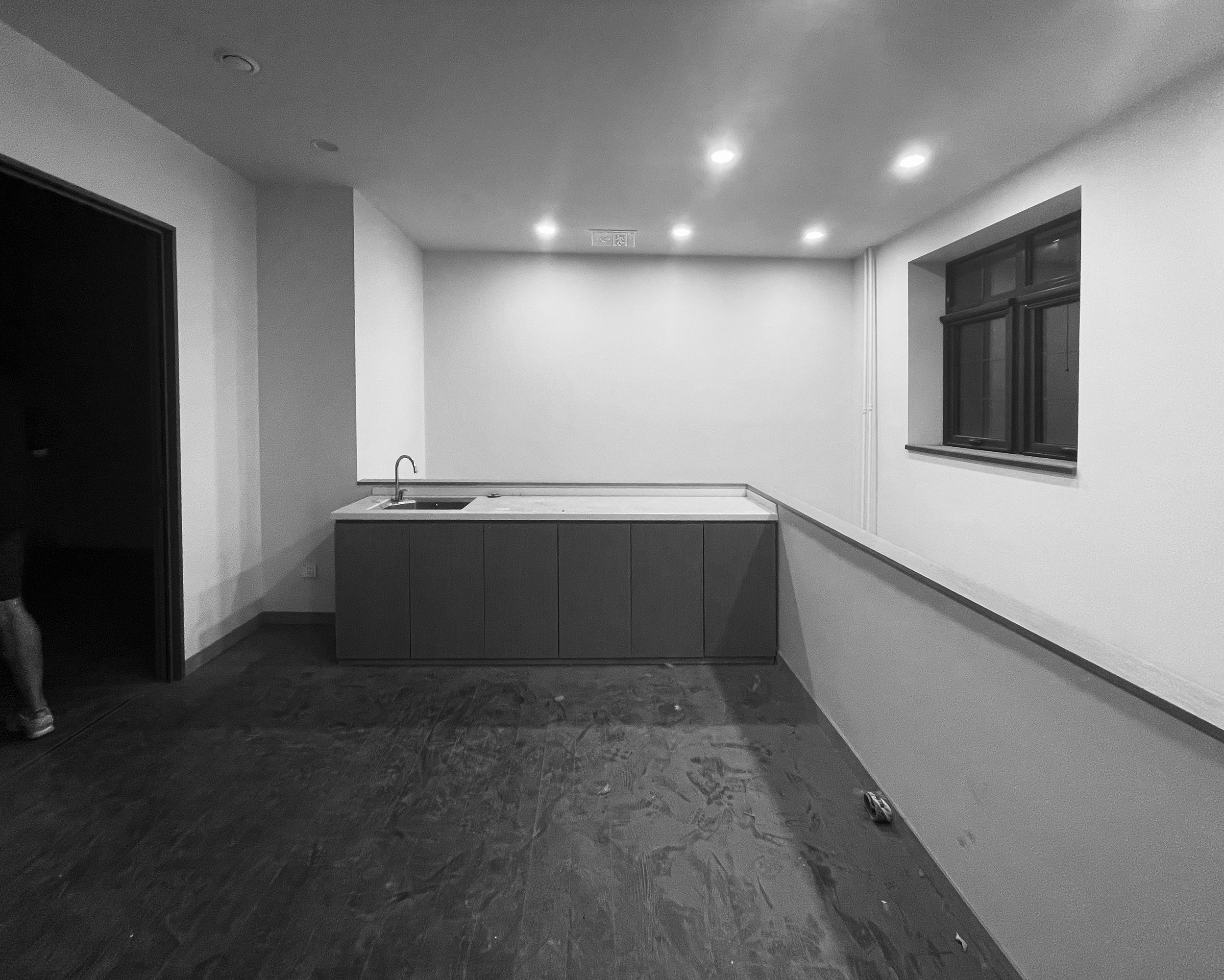
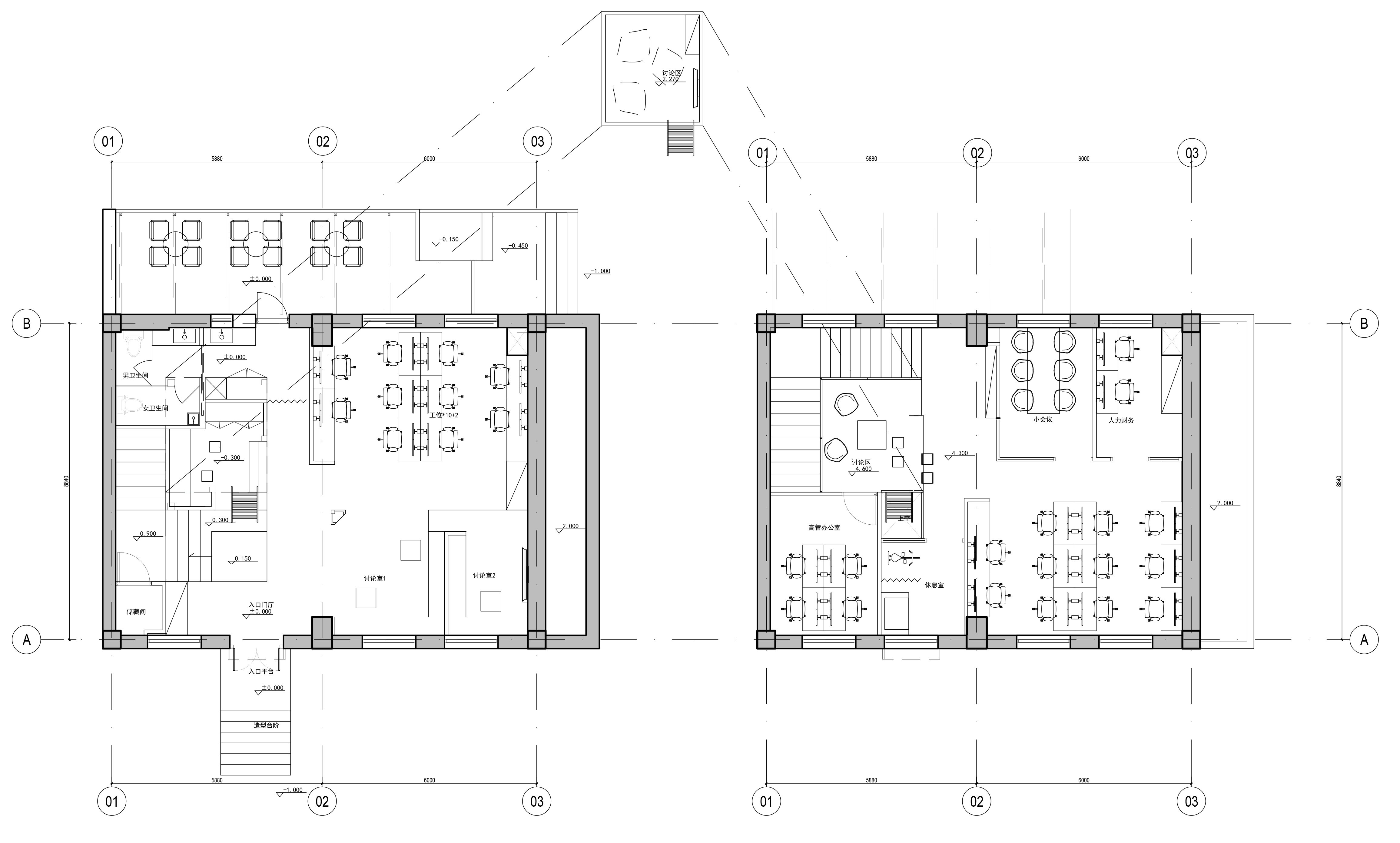
场地现状是一个190平方米的两层小楼,每层层高4.2米,两层楼之间通过一个楼梯连通。业主是一家广告公司,有着较大的会议讨论空间的诉求。我们通过功能强排,在满足基本工位数的前提下,会议空间数量无法满足任务书要求,而且无法做出舒适的公共空间。
The current site is a 190 SQM two-storey building with a single height of 4.2m, which is connected by a staircase.The client is an advertising company with a larger demand for meeting and discussion space. Through the functional arrangement, under the premise of meeting the basic number of work stations, the number of meeting Spaces cannot meet the requirements of the task, and it cannot make a comfortable public space.

在空中找机会
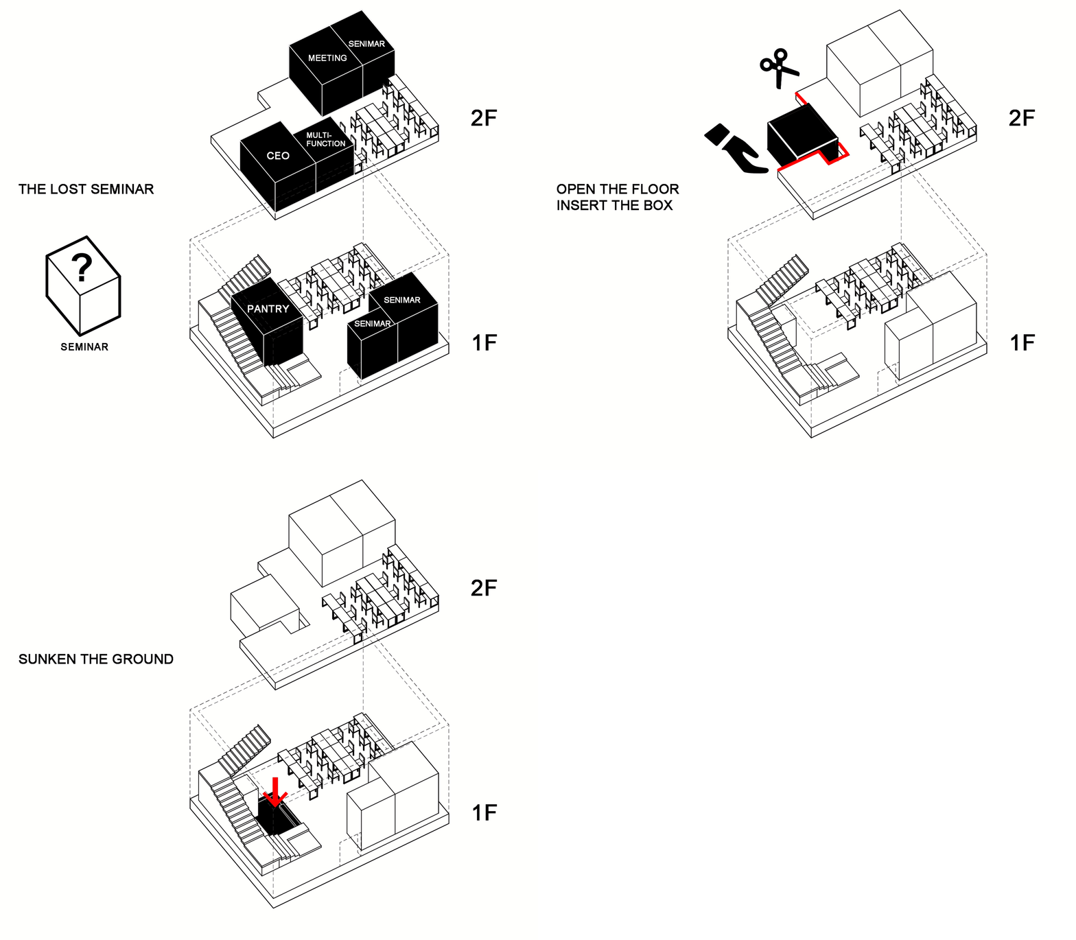
由于场地层高较高,且地面可以局部下挖,我们将设计的焦点放在了如何充分利用层高优势,通过设置夹层的方式找到更多的面积,同时增强上下楼在空间和行为上的关联性。
Due to the high floor height of the site and the fact that the ground can be partially dug down, the design focus was on how to take full advantage of the height, find more area through the mezzanine, and enhance the spatial and behavioral correlation between the upper and lower floors.
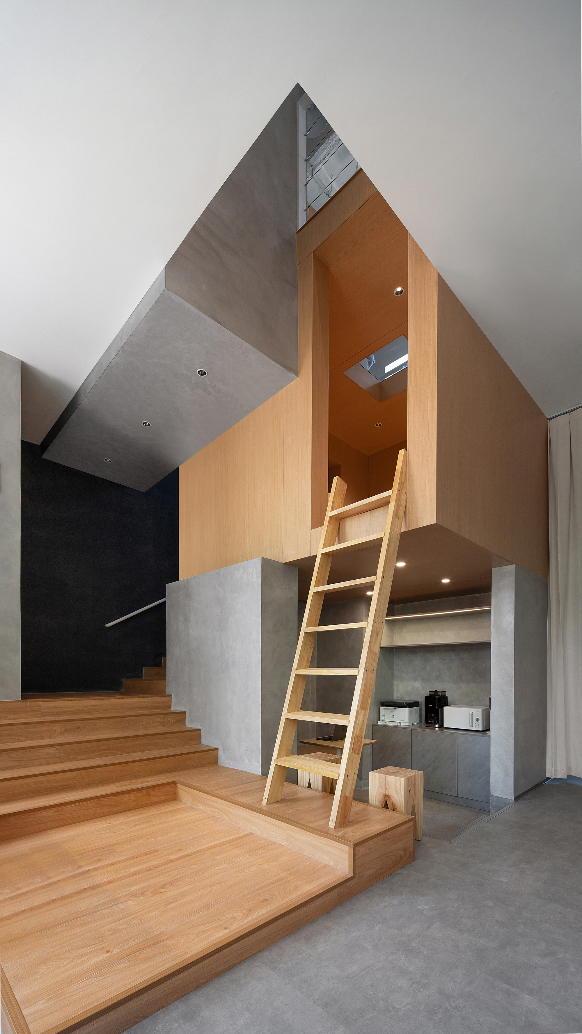
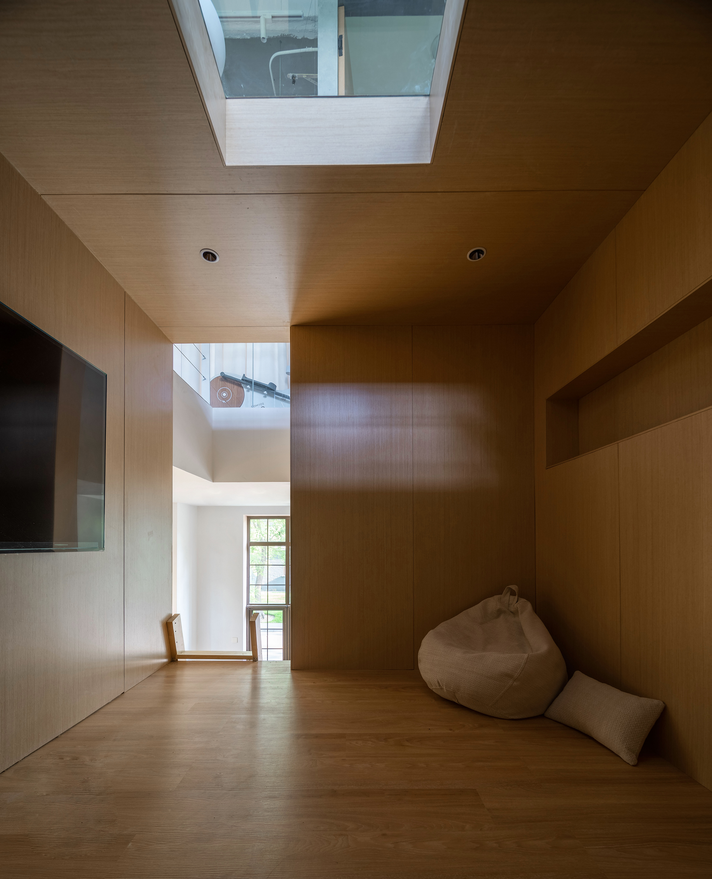
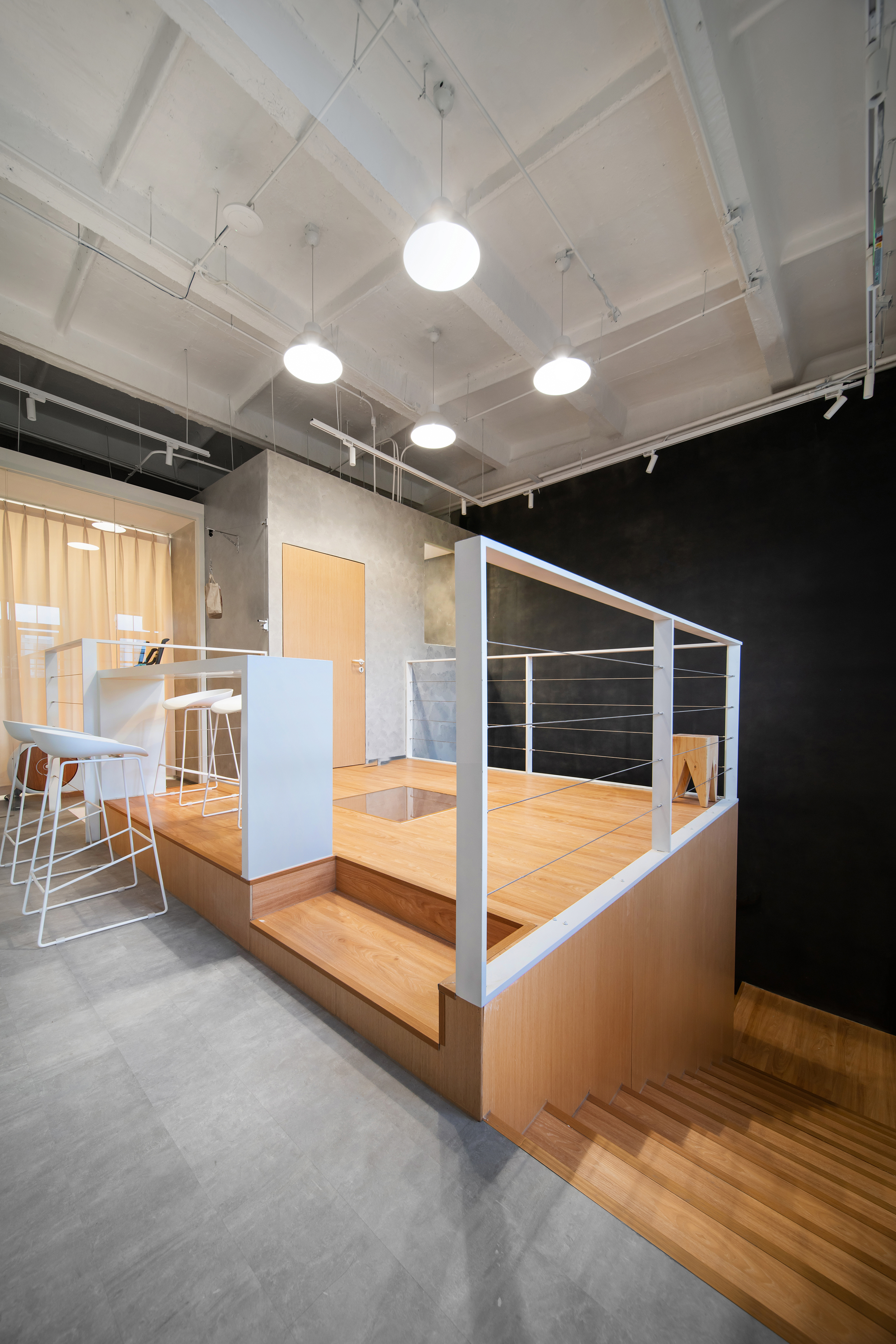
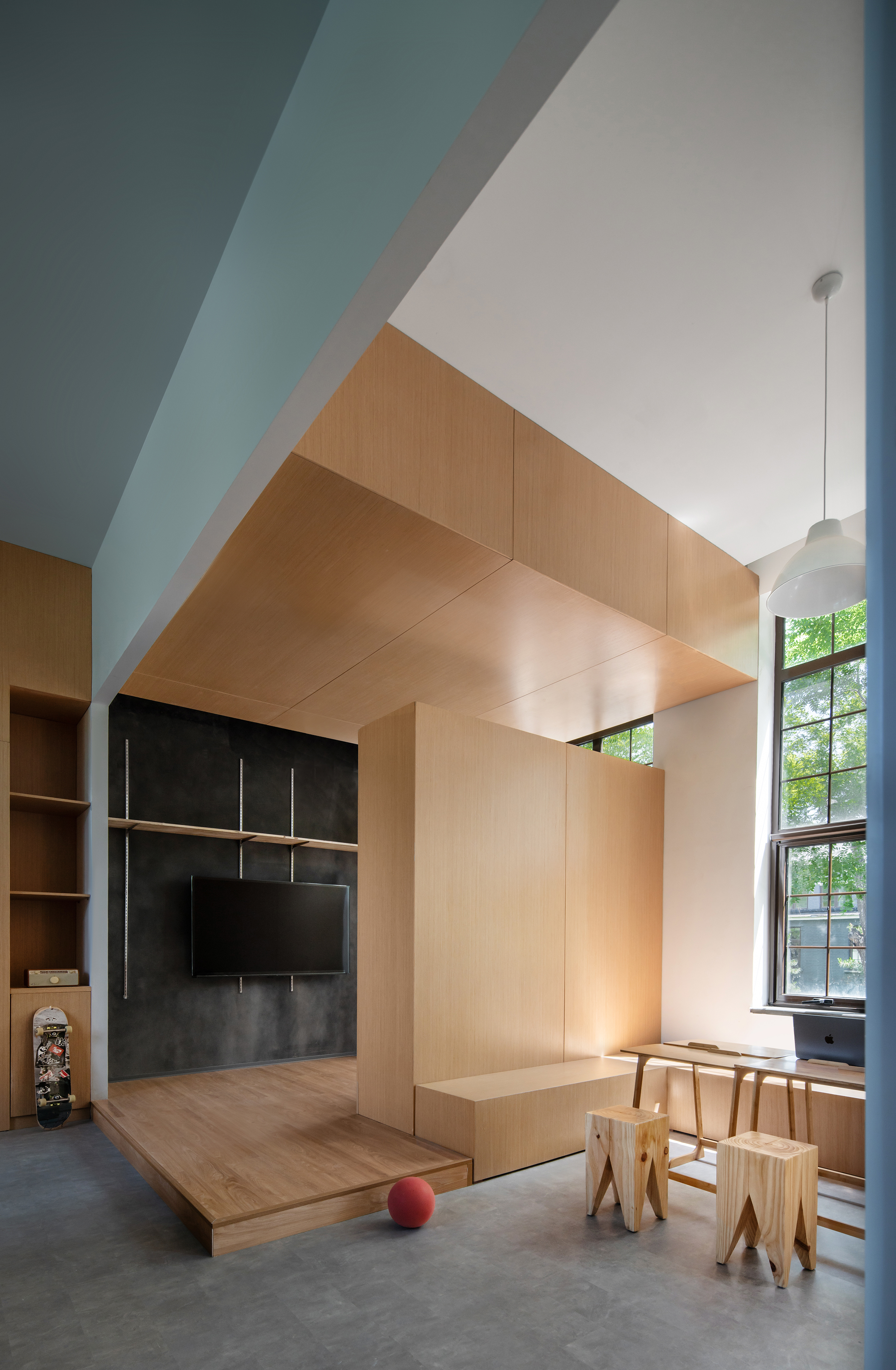
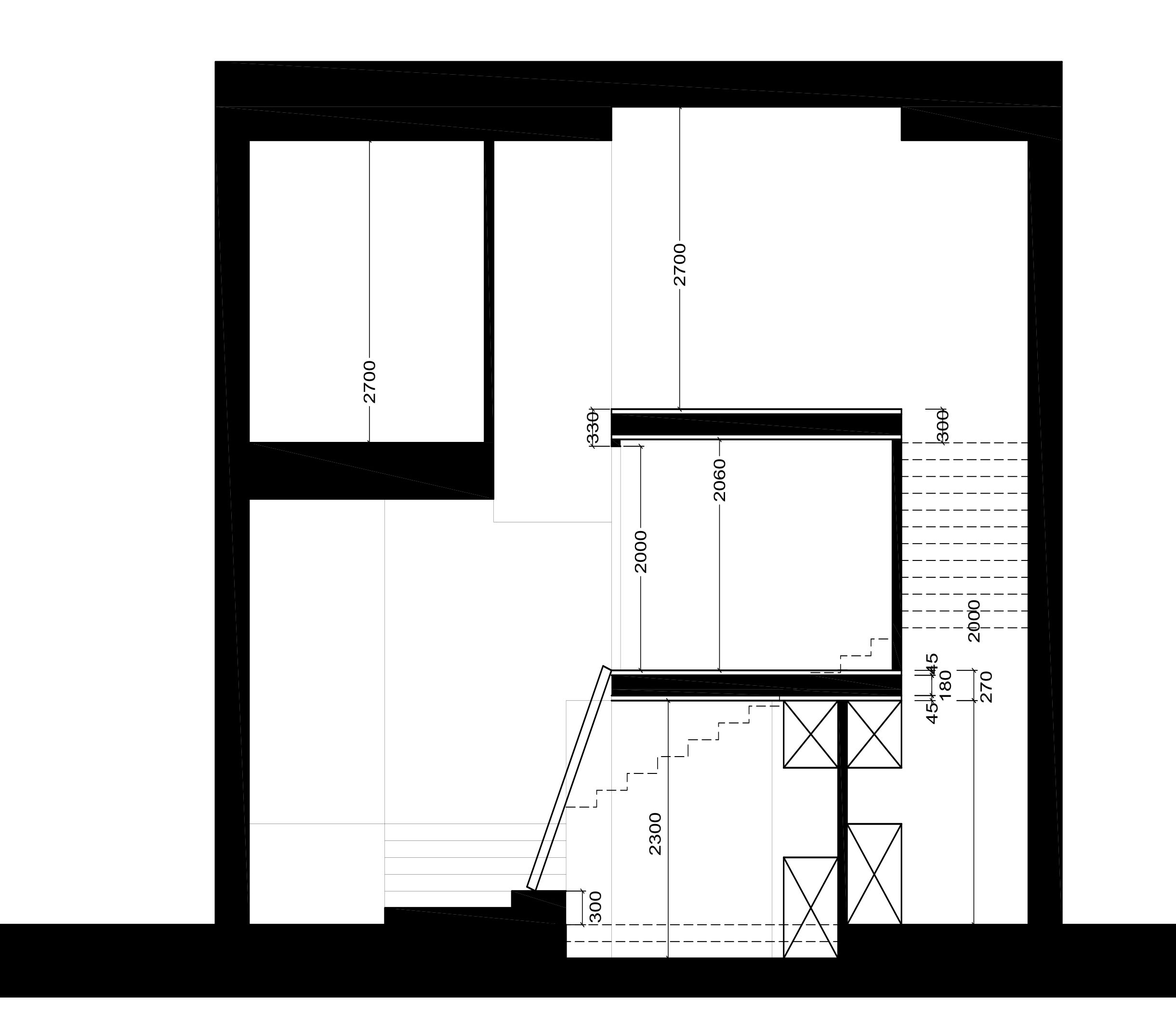
围绕楼梯,我们将楼板开洞并置入了一个悬浮的盒子,盒子下方地面下挖300毫米,形成放松的下沉式茶水间。盒子顶部高出二层地面300毫米,我们在二层创造出开阳的高台式讨论空间。盒子内部净高通过顶部和地面竖向的尺寸退让,创造出了静谧且有私密性的空中讨论间。
Around the stairs, we cut a hole in the floor and put a floating box into the floor, and dig 300mm under the ground below the box to ensure a comfortable clearance height, forming a relaxed sunken pantry. The top of the box is 300mm higher than the ground on the second floor, creating a high-table discussion space on the second floor. The 2200 net height is guaranteed, and the low furniture and the surrounding wooden walls create a quiet and private air discussion room.
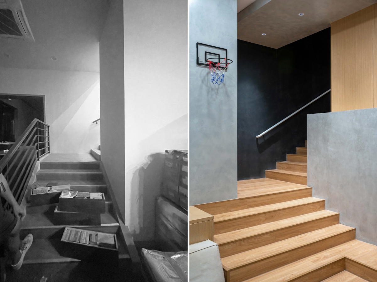
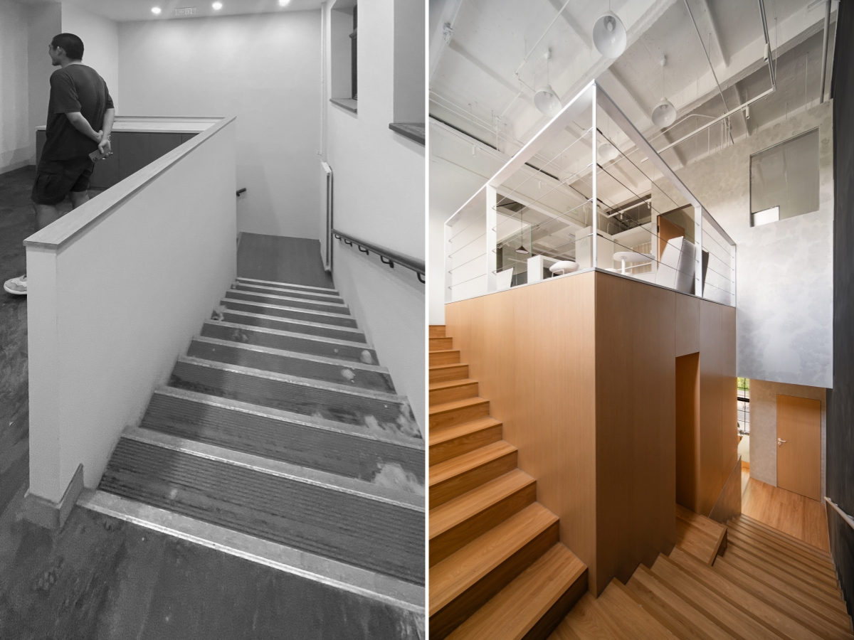
连接再连接
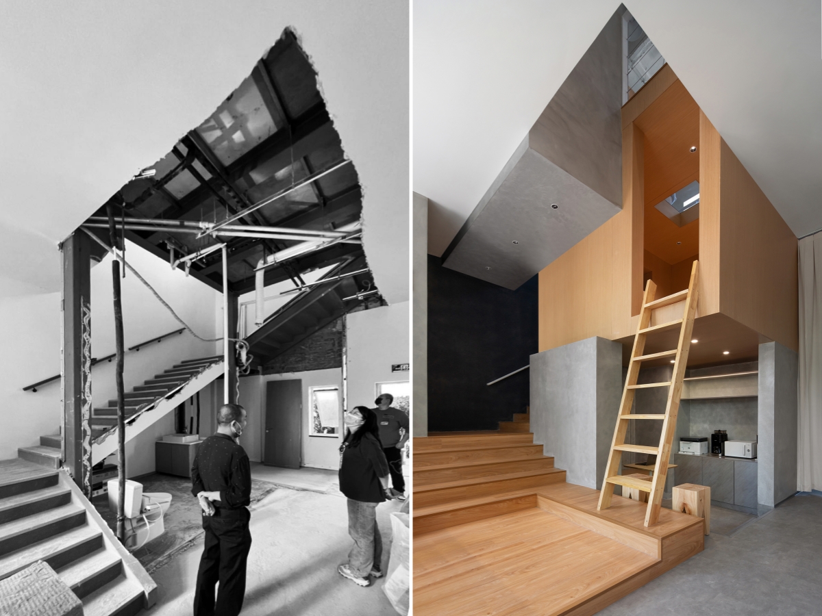
空间层面:本项目的主旨,就是通过公共空间将有形和无形的能量连接在一起。悬浮盒子的置入,将区隔上下层的楼板打开,楼板和盒子之间设置退让关系,形成局部挑空,视觉上可以看到悬浮盒子“顽皮”地飘在空中而不是贴在楼板上,同时挑空也让上下层空间具有了流动性。
Spatial:The placement of the floating box opens the floor that separates the upper and lower layers, and sets a conciliation relationship between the floor and the box, forming a partial lifting. Visually, you can see that the floating box "naughty" floats in the air instead of sticking to the floor. At the same time, the lifting also makes the upper and lower Spaces have mobility.
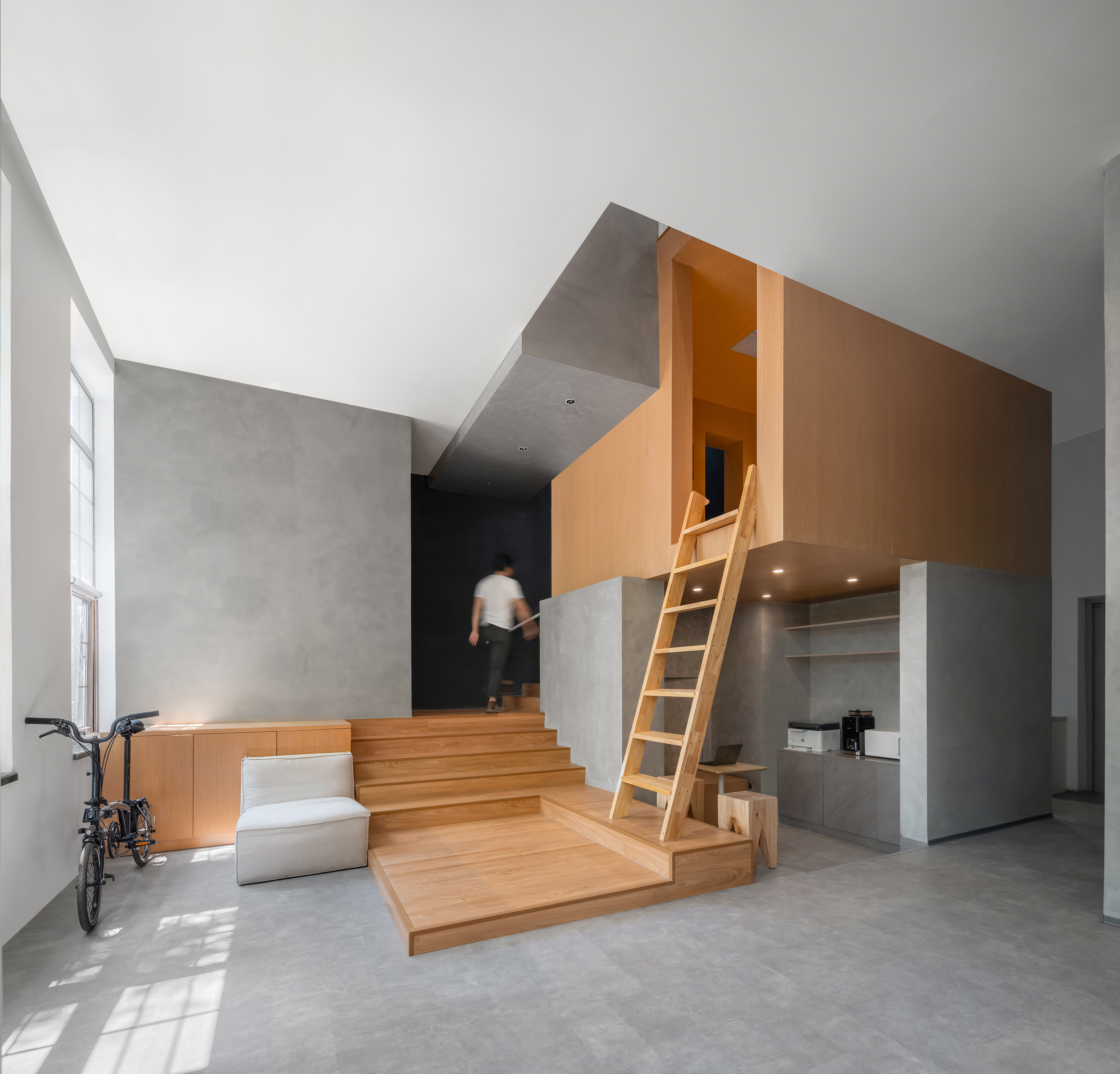

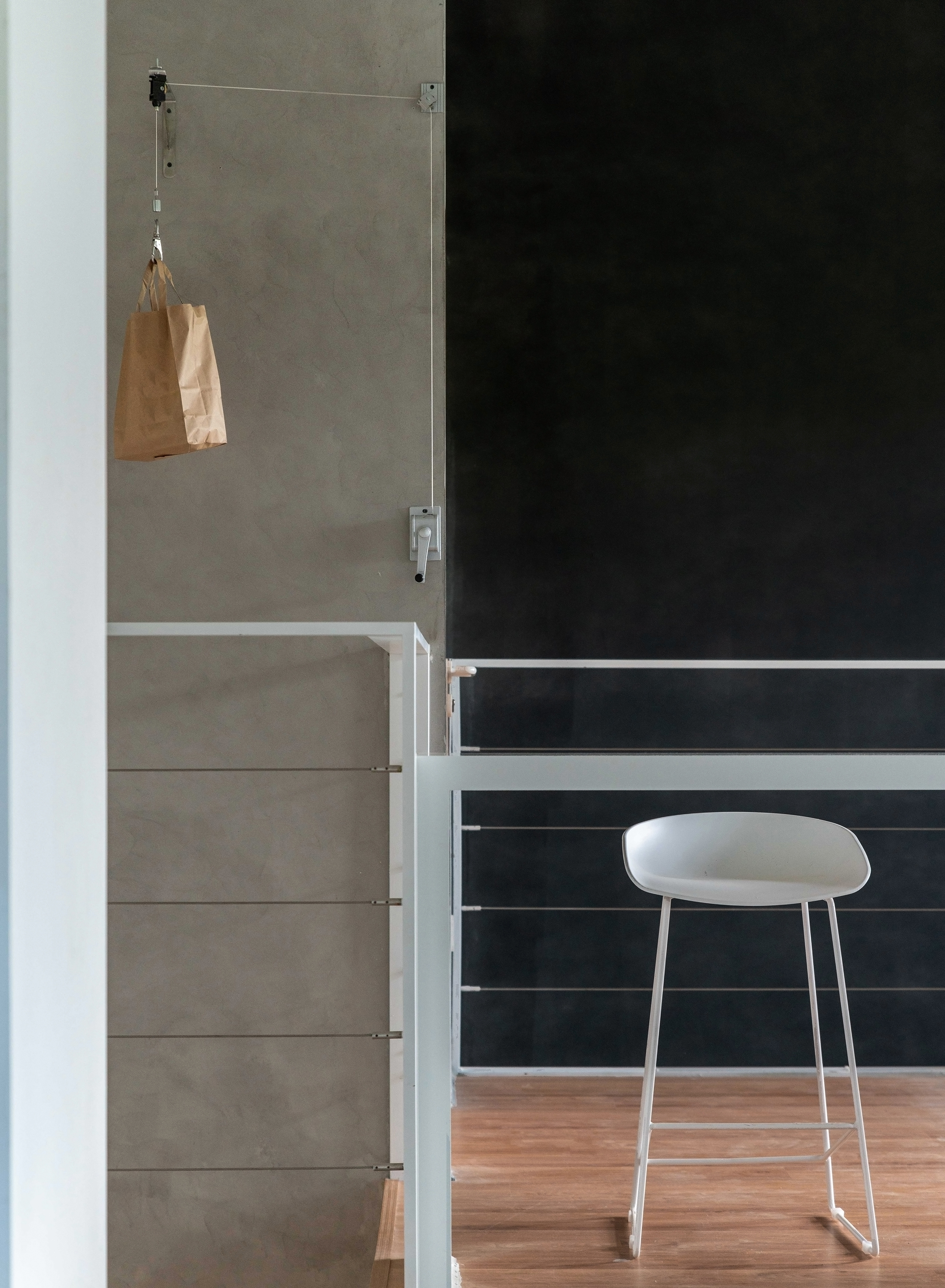
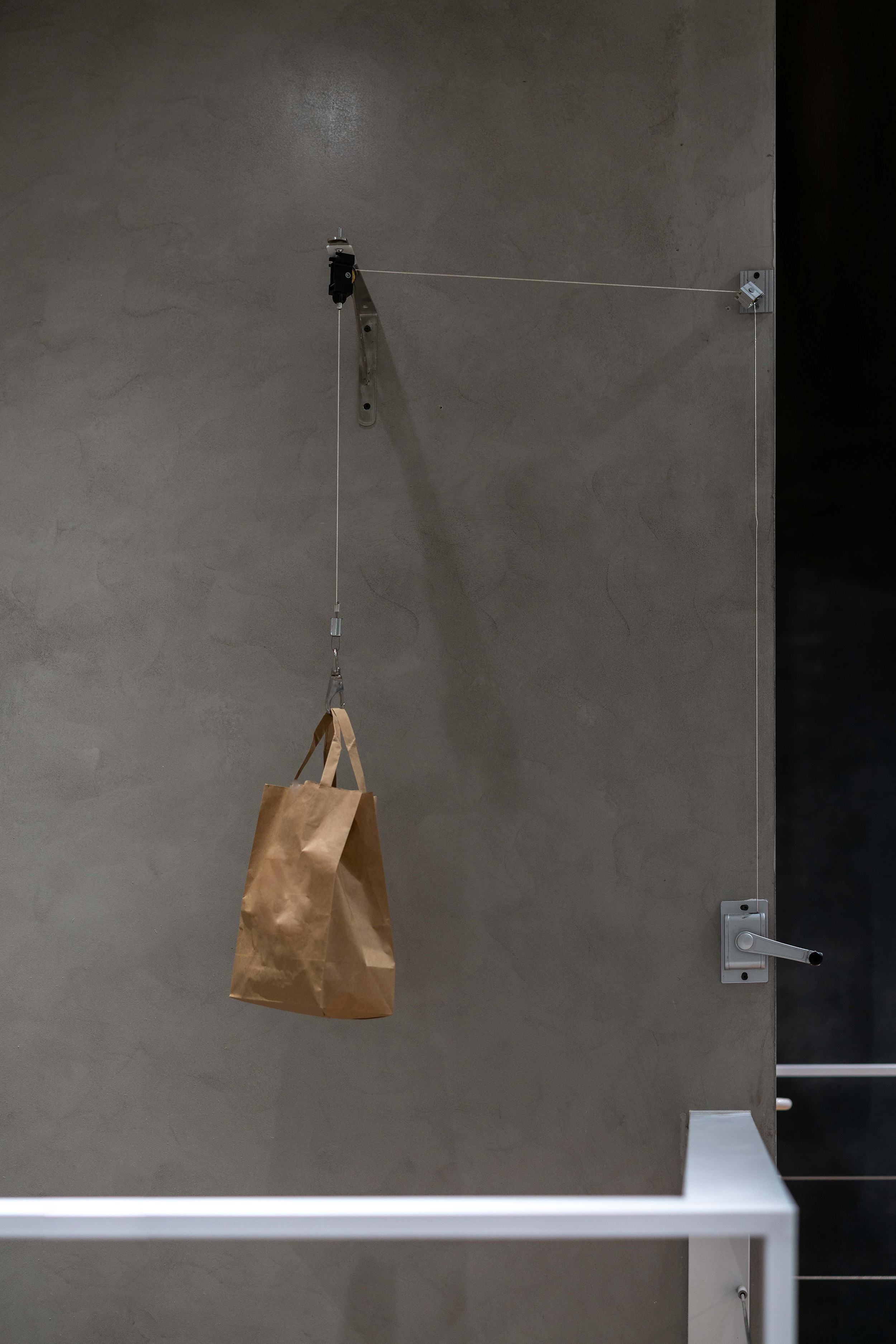
悬浮盒子与一层通过爬梯连接,与楼梯交接处我们设置了门洞,保证了一层二层于盒子的可达性,同时挑空处的二层墙面设置了轮轴装置,可作为两层之间物品传送系统。
The floating box is connected with the first floor through a ladder, and a door is set at the junction with the stairs to ensure the accessibility of the first floor and the second floor in the box. At the same time, a wheel shaft device is set on the second floor wall where the space is lifted, which can be used as a transmission system between the two floors.

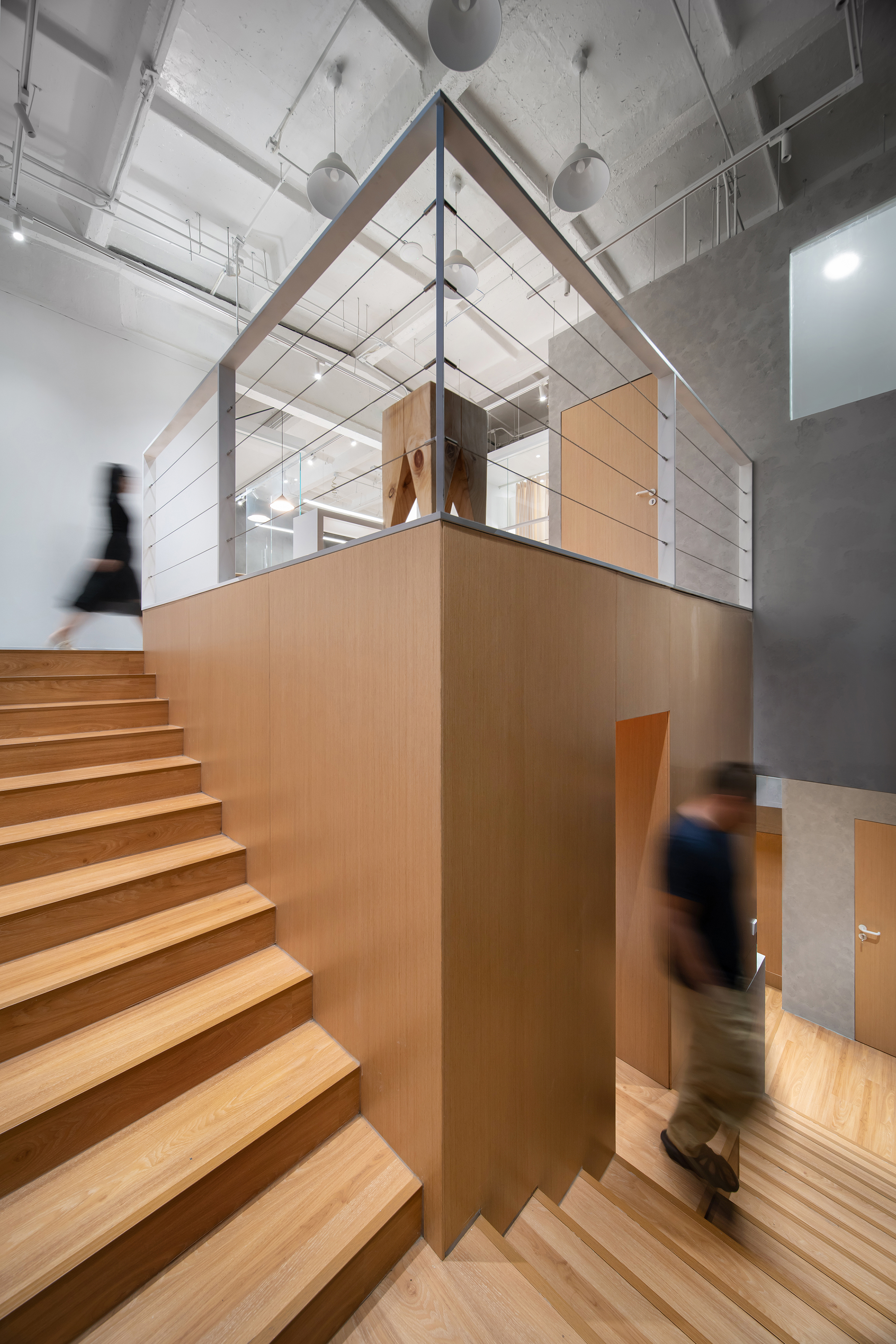
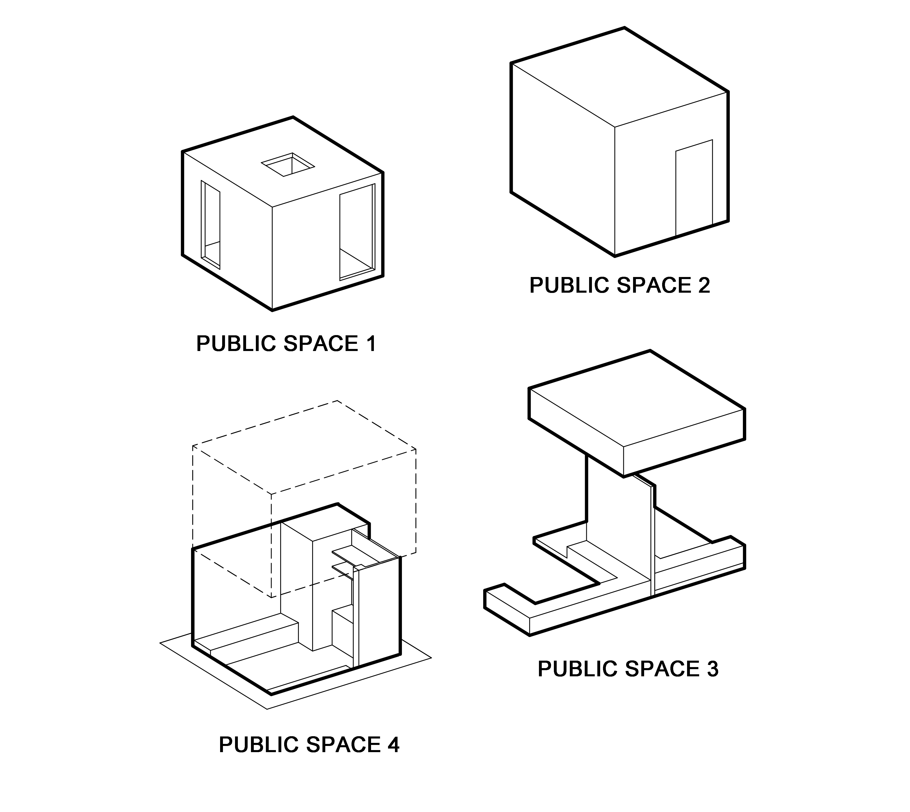
公共空间分为开放、半围合、私密这三种,它们满足开放讨论,运动休闲,独处休憩和内部会议的功能诉求。
Through the treatment of spatial scale, the public space is divided into three types: open, semi-enclosed and private, to meet the functional demands of open discussion, sports and leisure, solitary rest and internal meeting.
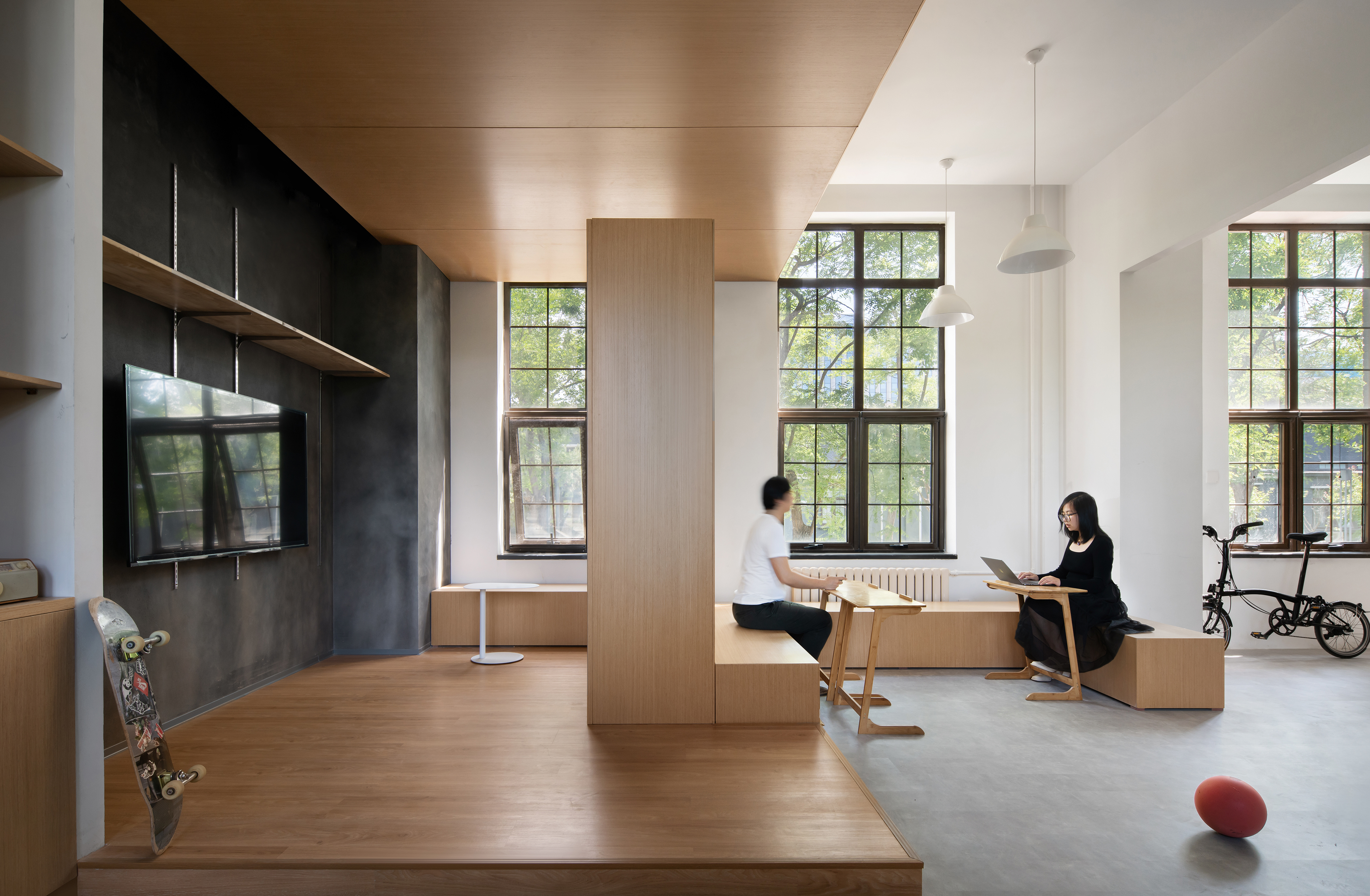

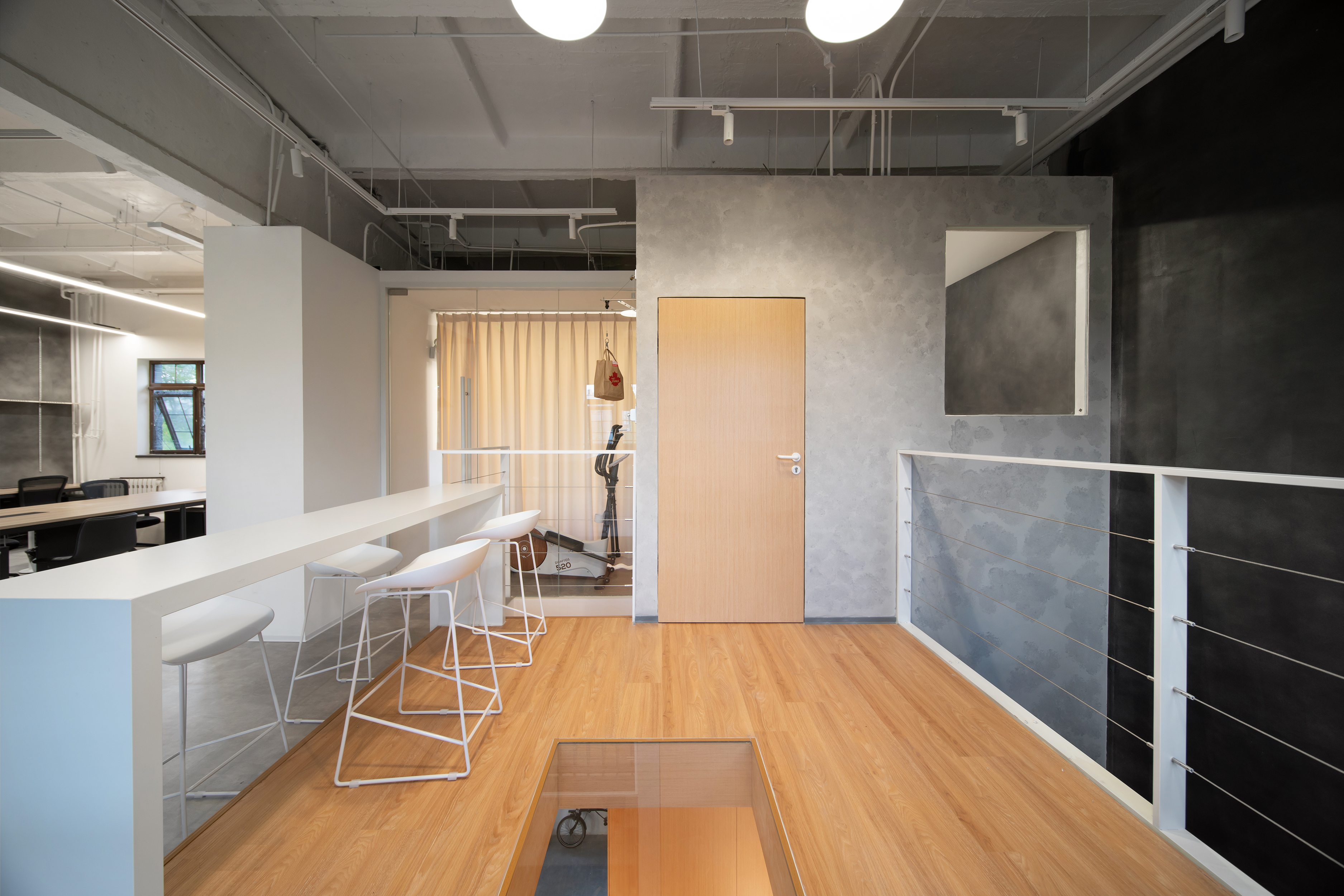
行为层面:我们在上下层分别设置了专属的公共空间,供部门内的沟通使用。而悬浮盒子的存在,则是打破部门的界限,让人们往中间走并聚到一起形成交流。同时悬浮盒子的进入方式分为走入和爬入两种,在保证实用性的同时也为办公体验提供了趣味性。贯穿两层楼的轮轴传送系统则是通过“传送”这个动作,进一步增加了上下层员工的互动机会。
Behavioral : We set up public space in the upper and lower levels respectively for communication within the department, and the existence of the floating box breaks the boundaries of the department, allowing people to walk to the middle and gather together to form communication. At the same time, the entry method of the floating box is divided into two types: walking into and climbing into, which ensures practicality and provides fun for the office experience. The axle transfer system, which runs through the two floors, further increases the interaction opportunities of upper and lower staff through the action of "transfer".



设计语言
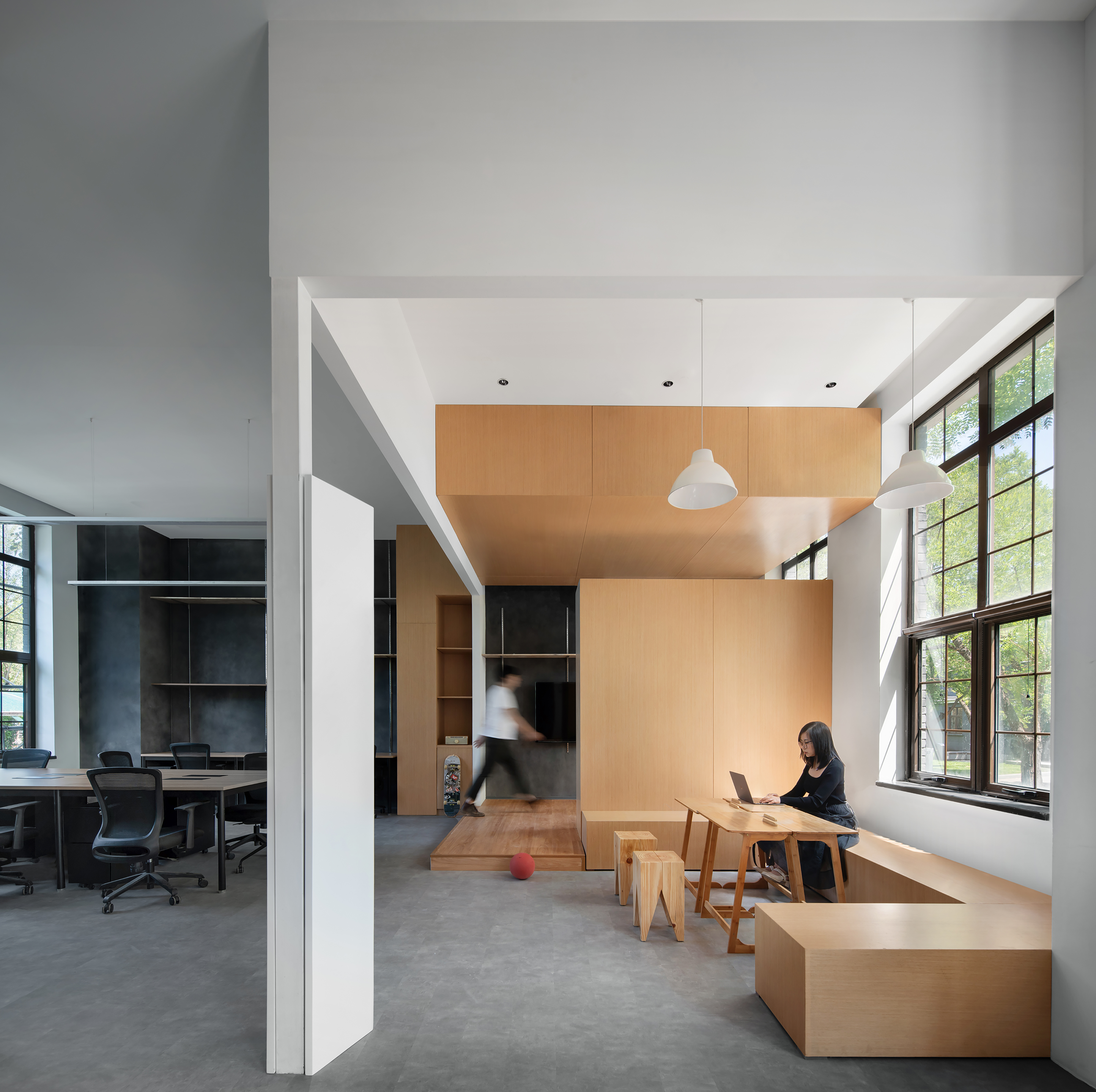
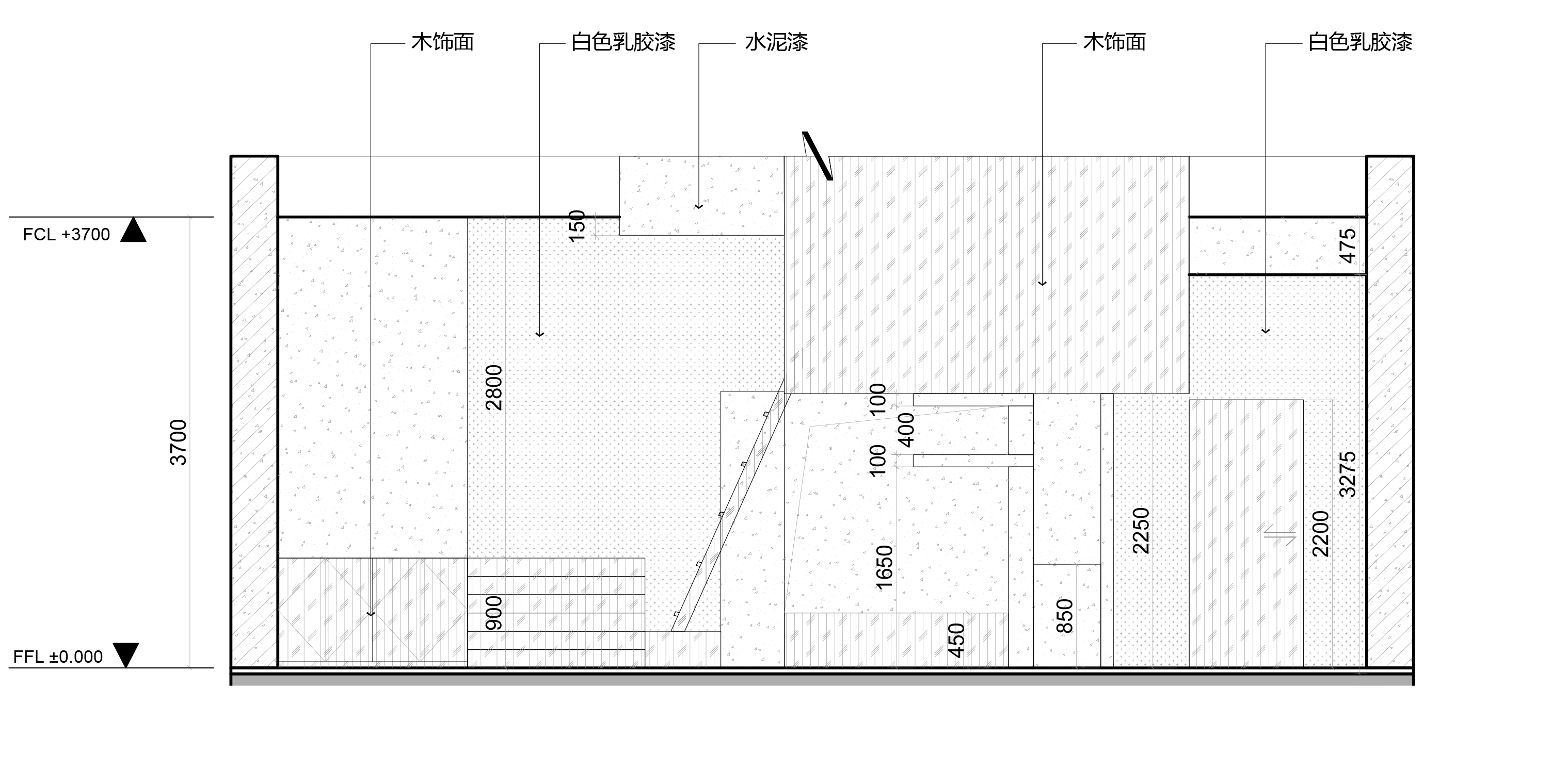
整体设计语言以体块切割堆叠为主,简洁的搭积木体量形式形成了活跃而不失逻辑的空间语汇。材质是木饰面,水泥漆和白色乳胶漆,朴素干净。在局部设计上,我们使用可分可合的单元式金属A柱和多层板展示系统,为业主自主调整企业文化展示形式创造了便利性。
The overall design language is mainly based on the cutting and stacking of blocks, and the simple blocks form an active and logical spatial vocabulary. The material is wood finish, cement paint and white latex paint, simple and clean. The partial use of separable and closed unit metal A-column and multi-layer board display system creates convenience for the owner to adjust the form of corporate culture display.
设计图纸 ▽

完整项目信息
项目名称:WOW广告公司办公空间室内设计
项目类型:室内/改造
项目地点:北京市朝阳区恒通商务园B32
设计单位:WBS里外工作室
主创建筑师:张哲
设计团队完整名单:杜月、张雯
业主:北京吾傲广告有限公司
建成状态:建成
建成时间:2023年3月
建筑面积:190平方米
摄影师:UKstudio
版权声明:本文由WBS里外工作室授权发布。欢迎转发,禁止以有方编辑版本转载。
投稿邮箱:media@archiposition.com
上一篇:巴黎圣母院修复工作,建设近况
下一篇:竹条编织的“青山之弦” / SODA建筑师事务所